Guest Post by Popup Maker
Since you landed on this post, you might be thinking, “What are the best marketing popups for course creators like me?”
You might even want to back up a little and ask, “Should I use popups on my site in the first place?”
And for the biggie, “Well, if I decide to ‘go for it’ and start using popups to market my courses:”
- “What kinds of popups should I make?
- “And how should I show them to my visitors anyhow?”
You’ll also discover why the most popular WordPress popup plugin called Popup Maker is used on over 700,000 websites.
What You’ll Take Away From This Post
If you have an online learning management system (LMS) and these are the kinds of questions that keep you up at night, don’t worry. You’ve come to the right place. In this article, we’ll answer these questions and might even dispel any fear that’s stopping you from using popups.
By the end of this post, you’ll be equipped with the knowledge to engineer your popups to guide rather than obstruct. You’ll have the power to use popups effectively to enhance your visitors’ experience.
As a bonus, we’ll cover what you should never do with popups. Meaning we’ll list the common ways to misuse popups that’ll absolutely derail your conversions and earn you penalties with Google search (ouch).
Ready? Let’s go!
Table of Contents
What is a popup anyway?
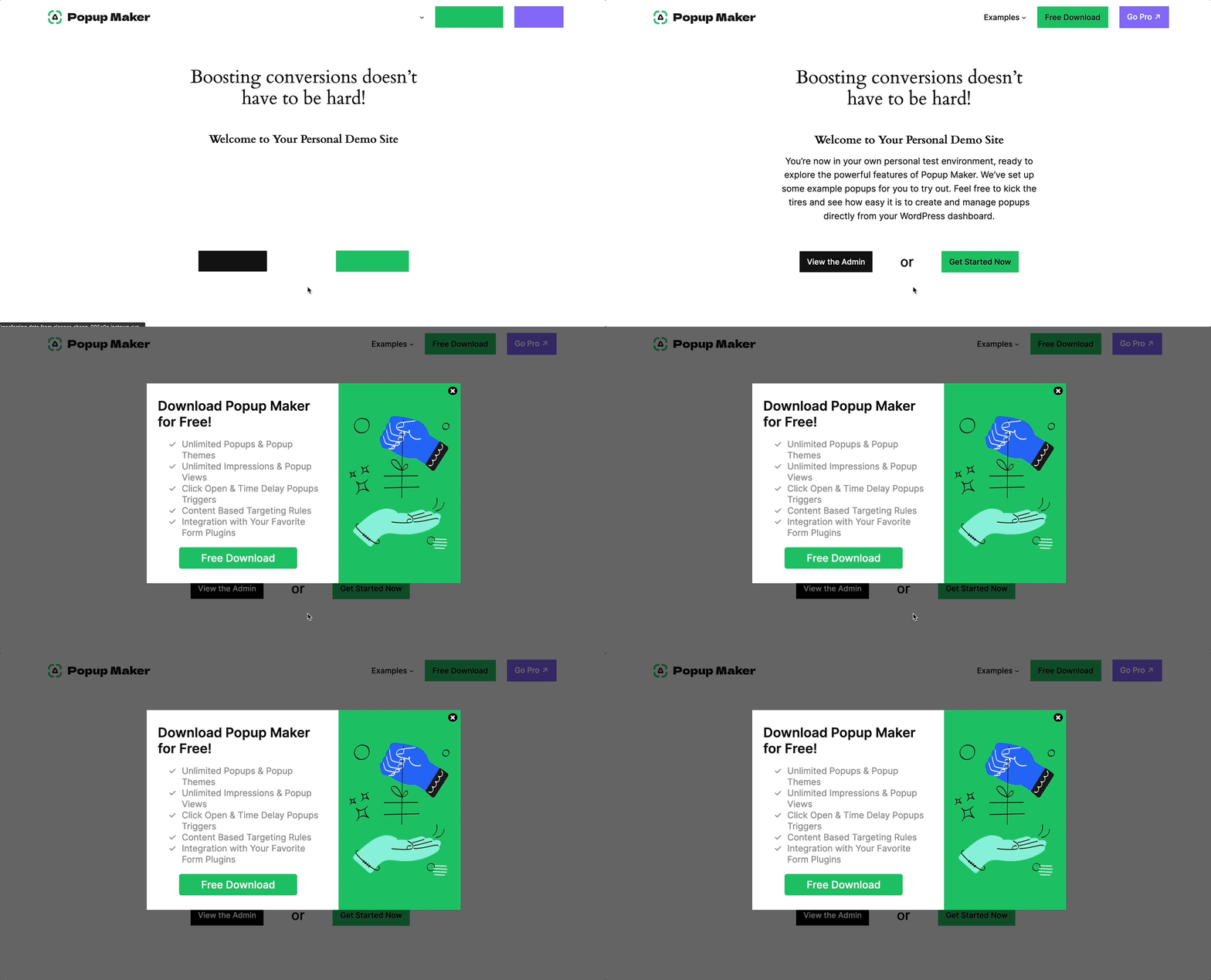
Let’s turn to the popup experts for the definition of a popup (also spelled pop-up). Here’s how the team at Popup Maker defines a popup.
“A popup or popup window is a smaller window that ‘pops up’ inside a browser window. Popups appear when some event or action triggers them (e.g., after a click or an amount of time). Popups usually display on top of existing content. You can control how many times a popup appears by setting a cookie.”
Now that you know what a popup is let’s see if they are worth your time.
Are popups effective?
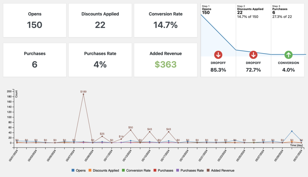
After collecting and reviewing the stats of all popups their customers used in 2023, OptiMonk saw an 11.09% average conversion rate. Let’s put that conversion rate (i.e., their click-through rate or CTR) into context with a comparison.
In 2023, MailerLite saw an average CTR of 7.38% from their customers’ email campaigns. That means about 7.38% (out of the total recipients who got the email and opened it) clicked inside the email.
So, just comparing the stats from those two industry leaders, popups are still a competitive option.
But hang on. Before rushing to crank out popups on your site, you need to understand that the way marketers use popups has evolved. Old-school (in your face) popups that ask you to “join the list” before you have a chance to read anything have lost their luster.
For example, OptiMonk’s highest-performing popups were cart abandonment popups, with an average conversion rate of 17.12%. We’ll see later how specialized and helpful these types of popups are.
Based on the stats, the “right” kind of marketing popup had impressively chunky conversion rates!
Sleeknote’s top popup stat from a 2024 study told them that customers love daily offers. They saw a 29.59% average conversion rate for daily offer popups.
In an April 2024 study, BDOW (formerly Sumo) found their top 10% highest-performing pop-ups averaged a 9.28% conversion rate.
This next stat is slightly dated, yet we want to include it because it’s still impressive. From March to August 2021, LearnWorlds’ top 20 popups had a 16% conversion rate.
The Top Popups for Marketing Your Courses
In this section, we list the three kinds of popups you should use as an online course creator. For each popup, we’ll cover the following:
- Describe the popup in a marketing context.
- Share use case ideas.
- Tell you what popup triggers you should use.
- Give you one or two real-world examples.
If you read until the end, we think you’ll be surprised to learn the secret behind which popup is best for you.
OK, here are the three types of popups.
Daily Offer Popups
Who doesn’t like a good deal? Based on Sleeknote’s impressive 29.59% conversion rate, we think daily offer popups should top your list.
Daily Offer Use Cases
Daily Quiz
Here’s a fun idea that combines daily offers with gamified popups. Why not set up a daily quiz or random knowledge contest? Similar to the Spin to Win (we’ll see in a minute), winners get a discount or free shipping.
What’s more, your audience (learners) are no strangers to quizzes. In fact, they’ll probably appreciate a quiz where they can win something!
Daily Holiday or Seasonal Specials
During the holidays (or any holiday period), you can offer daily specials to anyone who opts in.
One idea is to run a 24-hour special each day of the holiday period. Visitors can keep coming back to your site every day to see what new offer you have until they opt in to claim the deal.
Now, that’s a way to keep your audience engaged. Not only do you create excitement, but you instill a sense of urgency, too (the offer is limited and changes every 24 hours). Double bam!
Daily Offer Popup Trigger
These are the two popup triggers you should use for your daily offer popups.
Auto Open Trigger With Delay
At the minimum, daily offer popups should automatically open, but not right away. You’ll need to find the best delay time to give your visitors enough time to do the two most important things when they land on a site:
- Figure out if they are on the right site.
- See what value you provide.
It depends on your visitors and your content.
Exit Intent Trigger
Exit intent triggers are just what their name implies. These triggers sense when you’re heading for the exit (e.g., mouse leaving, sudden scrolls to the top, or lost browser focus) and launch a popup just before leaving.
Daily Offer Popups in the Wild
Slate
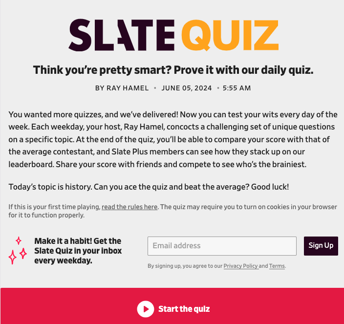
Slate taps into your “inner geek” in a hip sort of way. You can hit their site every weekday for a new quiz. Or you can sign up to get the daily quiz in your inbox.
Be warned. This quiz is fun. It keeps score and has a leaderboard (yikes!). So yes, it’s addicting.
Brad’s Deals
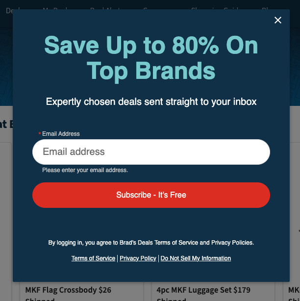
What can I say? Not only does Brad’s Deals daily deals popup grab your attention, but it’s also to the point, and it has one input field. That’s a winning combination.
Cart Abandonment Popups
If you’re a “multi-tasker” like most of us, you’ve probably done this. You add a couple of things to your online cart while you’re replying to some emails or on a Zoom call. You eventually forget to check out or leave without checking out to pay for your items.
Another likely scenario is when you go to check out and pay, you’re not happy with the shipping cost. You start having second thoughts or consider checking out the competition’s shipping prices.
Cart abandonment popups to the rescue! Cart abandonment popups serve a purpose. They show up just in time to save your shopping cart. They’re pragmatic. It shouldn’t be a surprise that they perform so well.
Cart Abandonment Use Cases
Leaving Courses in the Shopping Cart
Please do you and your customers a gargantuan favor. Let them know they still have items in the shopping cart before leaving your store. They took the time (sometimes a bunch of time) to navigate through all your products and carefully select the ones they wanted.
It’d be irresponsible not to give them a helpful nudge.
Not Finishing a Subscription Upgrade
Please give the same courtesy to new subscribers or existing customers who want to upgrade. If they accidentally start to leave the subscription or upgrade form, throw up a “flare,” letting them know they’ll lose all their changes and need to start over.
Cart Abandonment Popup Trigger
Exit Intent Trigger With Targeting
You’ll need a popup builder that supports exit intent triggers. There are multiple ways to exit a web page. Make sure your exit intent triggers can handle each case.
The other half of the equation is the ability to target which pages to show your cart abandonment popup. You don’t want a cart abandonment popup showing when someone starts to leave your home page, right?
So, your popup will need targeting features on top of exit intent triggers. That way, only your cart and checkout pages can show the cart abandonment when they need to (i.e., exiting when items are in the cart).
Cart Abandonment Popups in the Wild
Surprisingly, about half of the e-commerce and LMS sites I visited while writing this post did not have exit intent popups for their cart or checkout pages. Don’t be one of those sites.
Here are two examples of cart abandonment in the wild.
Popup Maker
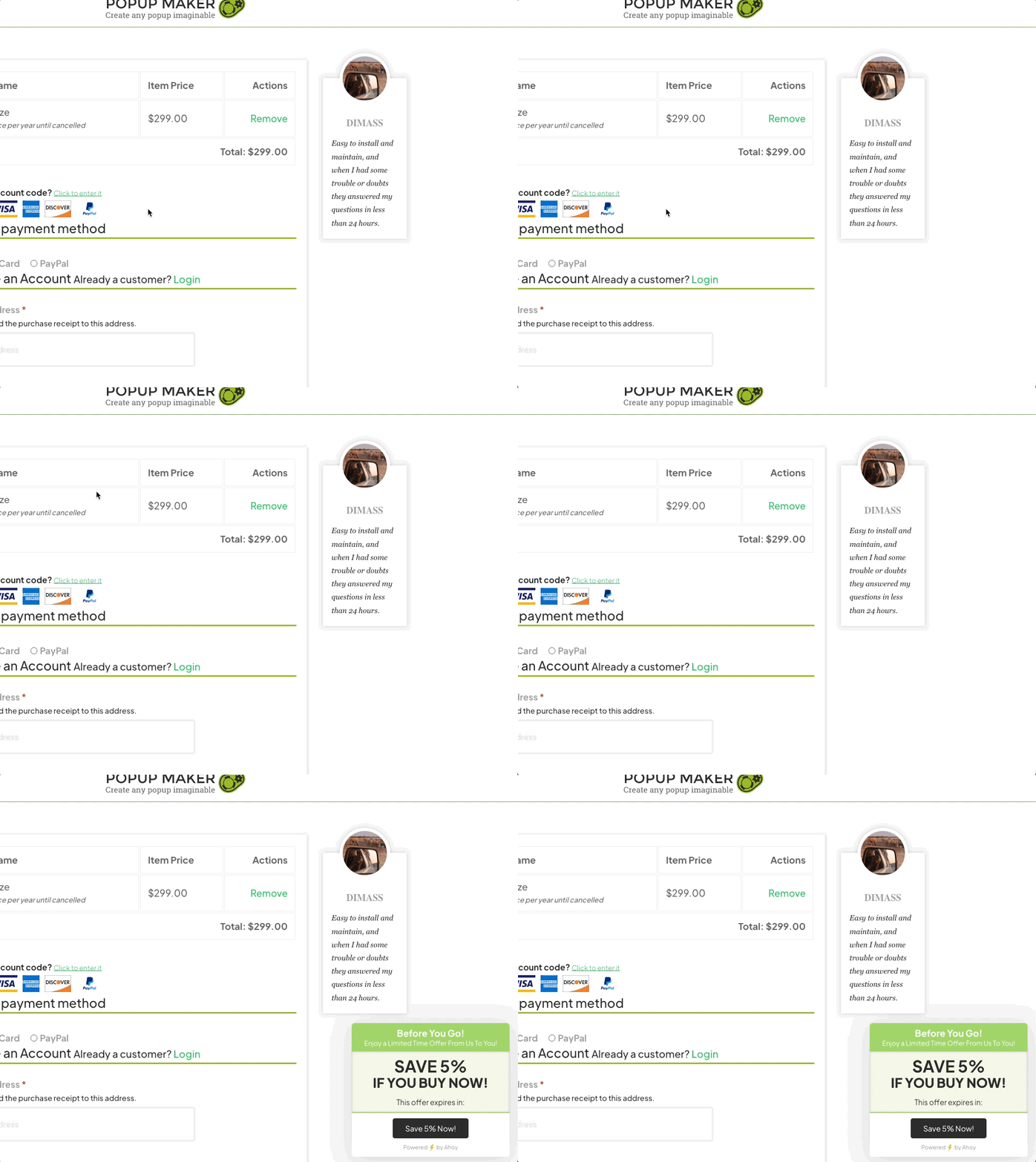
The Popup Maker site shows a discreet “Before You Go!” popup in the lower right when you try to exit the checkout page.
WP Zone
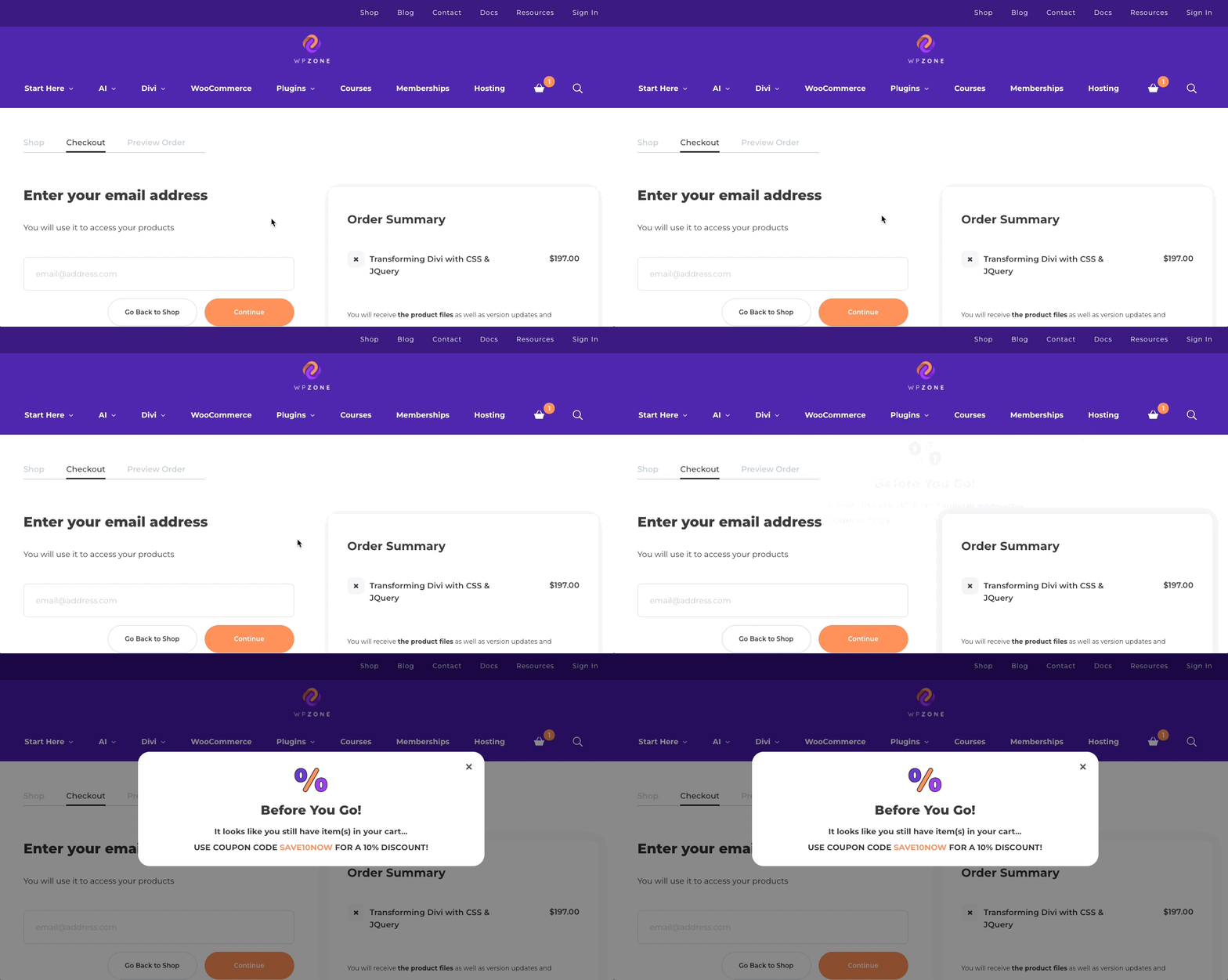
WP Zone displays a full lightbox modal popup when you try to leave the checkout page before paying.
Lucky Wheel (Spin to Win) Popups
To understand why gamified experiences are so powerful, we need to know the basic rule of partial reinforcement (specifically variable ratio schedule). Based on B.F. Skinner’s legendary theory of operant conditioning, people respond better and longer when reinforcement (winning) is unpredictable.
In simple English, people get bored when they win at something all the time. But if you win once in a while (randomly) and don’t know the next time you’ll win, you’re hooked.
Hence, the power and excitement of lucky wheel popups.
Lucky Wheel Use Cases
There’s one main use case, and it’s simple.
After your visitor has been on your site for a minute or so, show them a lucky wheel popup. The lucky wheel popup can offer:
- Varying amounts of discounts (e.g., 10%, 20%, 50%).
- Varying amounts of discounts or free shipping.
- A range of gift card values (e.g., $5, $10, $75).
Lucky Wheel Popup Trigger
Make sure your visitor has enough time to look around on your site or the page they just landed on. That means you should use the following triggers:
- Auto display trigger with a delay.
- Scroll trigger that’s set to trigger a popup after someone scrolls past 50% or 75% of your page, for example.
- Exit intent trigger as we suggested for the daily offer popups.
Lucky Wheel Popups in the Wild
Isabelle Grace Jewelry
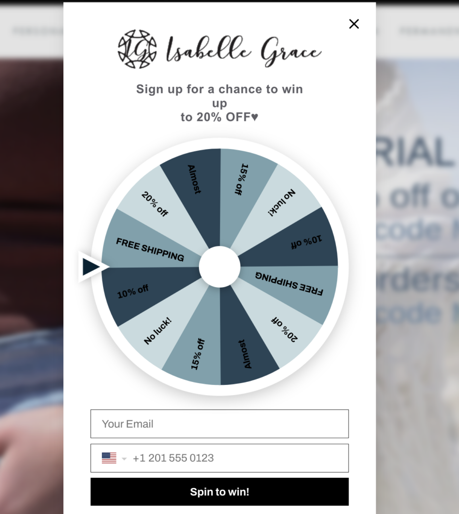
Isabelle Grace Jewelry uses a scroll trigger to launch their spin to win popup on their homepage. They offer up to 20% off or free shipping for your email.
Luna Nella
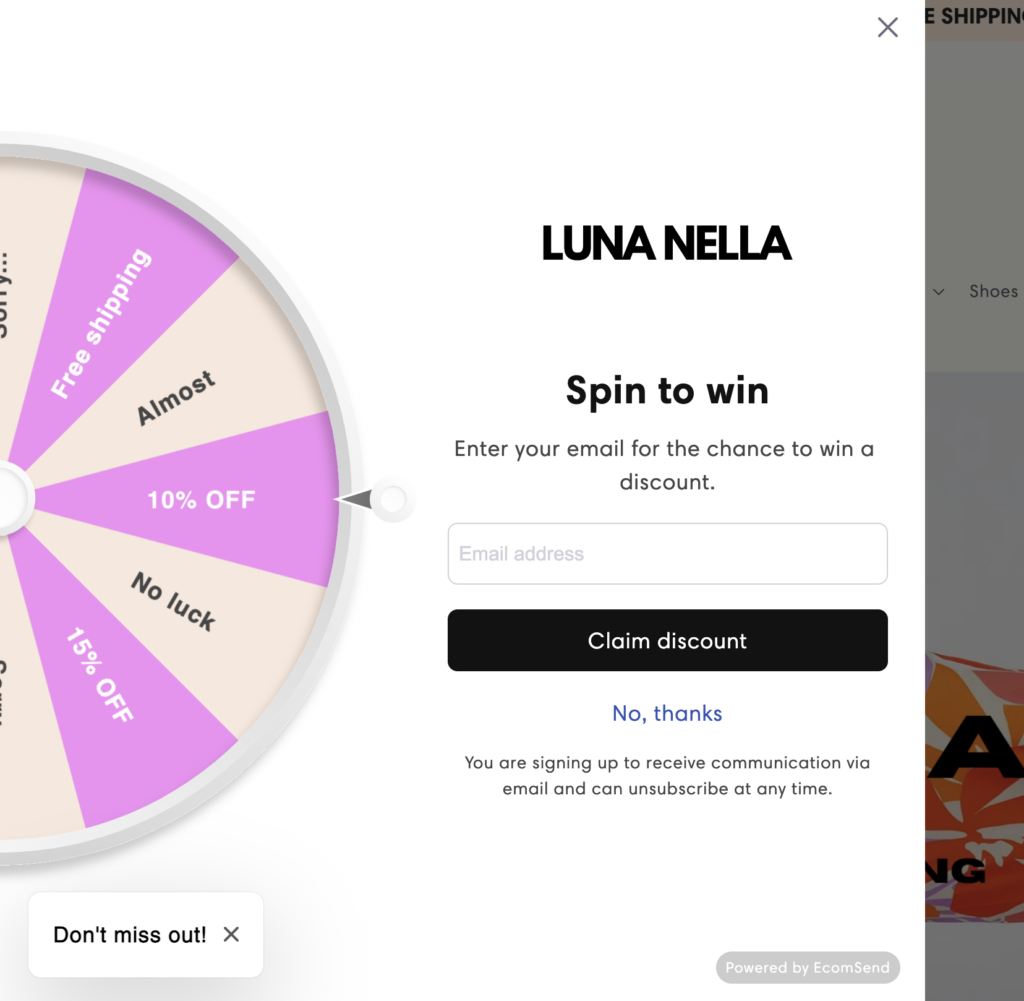
Fashion brand Luna Nella uses an auto-open trigger to display a wheel of fortune popup that offers free shipping or a discount for your email.
We don’t recommend using an auto-open trigger unless you can set a time delay for it. We’ll get to that in a minute.
Daily Steals
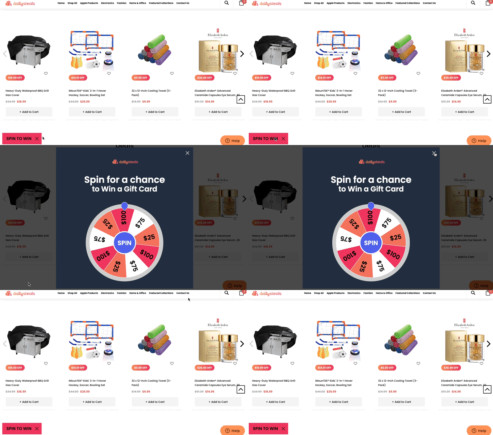
You’ll also see a spin to win auto-open popup (with no delay) on Daily Steals’ homepage. Unfortunately, their popup launches before having enough time to read anything. But they offer a chance to win up to a $100 gift card.
The cool thing about their popup is that it “minimizes” down to the lower left as a sticky popup (aka teaser). That means you can dismiss the spin to win popup to go shopping first. Then, if you’re feeling lucky, you can play the wheel to win a gift card later.
How Not To Use Popups
We’re so glad you made it this far. That’s because right now we’re going to give you the most important piece of advice for using popups as a course creator.
Don’t blunder. Meaning don’t lose visitors because of popup misuse.
Image Credits
The author made all the screen captures and the memes.
Created with the Meme Generator
Here are a bunch of tips to help you avoid blundering.
- Never let a popup be the first thing a visitor sees when they bring up your site. This doesn’t include popups required by law or login popups for private sites. Use a delay timer if you want a popup to display automatically. To find the best delay time, run split tests (aka A/B tests) or look at time spent on page analytics.
- Similarly, don’t show a popup before it’s time to. For example, avoid displaying a popup asking people to sign up for blog updates before they even read a blog post.
- Don’t force people to click on the x or close button to dismiss a popup. Allow them to click outside the popup or hit the escape key by default. You can also set an auto-close timer if your popup builder supports that.
- Don’t spam people. Don’t display the same marketing popup to someone who has already seen it and closed it. I.e., use cookies.
- Don’t “block” people from viewing your content. Avoid popups that take up the full page and block all underlying content (modals). One exception is using a teaser for previewing premium content.
- Be concise. Don’t be long-winded. Your language should be simple, clear, and short.
- Watch out for form field creep. Resist the temptation to make people fill in way too many fields in a form.
- Don’t interrupt. Don’t launch a marketing popup when your visitor is in the middle of a workflow (e.g., setting up their profile, resetting their password, registering for a course, or refining their search criteria).
The Vital Takeaways
Hopefully, by now, you’ve picked up on what really makes a successful popup. Before you go, we want to make sure you take away 2 crucial concepts.
Hey, did you guess what the first vital takeaway was?
Context
That’s right. Context is huge! We cannot stress that enough.
This is the secret sauce for knowing the best marketing popup you should use as a course creator. Are you surprised? Were you expecting the proverbial, “You should be using all click open lightboxes or use banners instead of slide-ins.” blah blah blah?
Nope. The right popup for you depends on the context (i.e., use case).
Here are a couple more examples of using popups in context to drive home this massive takeaway.
- Related courses: If you have a student who just finished a milestone in a beginner’s course, use a timed popup to tell them about your master class on the same subject or a related course that’s popular with people who took the same beginner’s course.
- Hesitant shopper: If a new visitor has been on the pricing page for 30-40 seconds, launch a popup offering them a promo deal. This scenario is the perfect place to do a lucky wheel popup.
Testing
In the context of this post (see what I did here?), testing tells you how long to delay your auto-open popups and which kind of gamified popup works better for your audience.
For example, run split tests (same thing as A/B tests) using two versions of the popup you want to test. Show a 30-second delay version 50% of the time and a 60-second delay version for the other 50%. You should also look at your site analytics (e.g., Google Analytics) to get the time people spend on your pages. Cross-reference your analytics with your split tests, and you’re good to go.
Or do an A/B test between lucky wheels and scratch card style popups to see which one your visitors like better. In fact, you can run split tests on just about everything, e.g., headings, offers, layouts, colors, forms, and CTA, just to name a few.
Note: We only briefly touched on testing here because testing it would need its own dedicated post to do it justice.
Over to You!
Based on this “new age” way of looking at popups, we think you’ll become more mindful when it comes to your learner’s intent. Being learner-centric rewires your brain to empathize more. In turn, you’ll design popups that help learners instead of hinder or annoy.
So, now it’s time for you to make context-sensitive popups. Here’s an example workflow to follow.
- Build your learning management system website (if you haven’t yet).
- List your popup use cases.
- For each use case, highlight the context that will drive what kind of popup to display.
- Choose a popup builder that has built-in support for the triggers you need for your popups.
- Run tests and check your analytics to see if you’re hitting your goals.
- Put your test and analytics results into a feedback loop to refine your popup to reach your target.
Image Credits
The author made all the screen captures and the memes.
Give your LMS website site the pop it needs.
Use popups to grow your email list, generate sales, and gamify your eLearning website.


